The music for each section was chosen as we had only chosen a genre we then looked for music to go well with the animation. This could have been done in the opposite order but we may not have been able to animate as well as we wanted to with the music
With the pieces rendering the group used adobe premiere pro 2 and decided on how cut audio and order of the scenes for the final product. We added a lot of fade outs to show transition between the different characters with the fade out of the different music with each segment.
Titles were also added with each character section to show the names of each character and at the end to give the information needed on the live band night such as where the YMCA is and timing.
Overall I think the piece looks and works well as an advertisement but in a lot of the clips the animation is hard to notice but the camera work with the clips works very well.
I encountered a lot of problems with the bones and skin of the M but in the end I think the character looks good and with his small and simple bits of animation works well.
Friday, 12 December 2008
Friday, 5 December 2008
Week 11

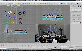
I added lighting to my M scenes to give it a more concert/club type feel and add more into the scene. The lights were created and positioned to come from the lights on the stage. I animated the lights to move in patterns using the animation option of a path constraint and creating a line to act as a guide.
This week was used to render my own clips of the M and help do any other pieces that the group needed doing. With this I boned the A character as James was working on setting up the stage to have the characters perform on.
Boning the A was simple but because of the shape it had very little ability to move its legs but it had enough to have it able to tap his leg to a beat giving a simple animation.

After helping with the A, I thought about how to sort the band scene at the end we had decided on. For the band scene I decided to create instruments to be used. I started making drums out of cylinders and boolean holes out of them to create covers for the drums which could have textures on them. The drums were linked together with a frame I created to show that the drums where more realistic instead of floating in the air. The outside of the drums has a reflective texture so that it would look good with the lighting effects. The drums were not animated but the decision was to not to until the animation in the stage was already done so that the cymbal would react to the music and not randomly be played.
I also created an acoustic guitar to be used in the band scene for the Y since it currently had no instrument and looked out of place. The guitar was created the same as the flying V guitar made for the heavy metal M.
Later on during creating the band scene the acoustic guitar was dropped out as the Y looked better without carrying a guitar.
With the band scene the animation on each character was changed to avoid it all looking the same and simple cartoony animations of the characters jumping and moving was instead added to imply the emotion of happiness and that the characters are having fun.
Friday, 28 November 2008
Week 10
The animation of the M did not go overly well moving the M caused a lot of problems with the skin causing lots of folds and dents to appear, as well as during walking it the shoulders of the M separated and caused it to stretch and deform.
In the end the animation of the M was a simple walk forward and had the guitar move up and down to look as though it was being played as well as a floating guitar can. This also caused conflicts on whether the M should use his legs to play the guitar but this would cause the M to randomly float and out of the two the guitar floating was the less of two evils as well as overall actually looking good.
With the animation I added several cameras so that I could render different views of the animation rather than just a face on shot of the M walking.

I tried to improve the M walking by making his legs look more obvious in the scene using more movement but with this I had trouble with the bones in the M which were causing the Ms Legs to fold skin and look very unnatural since the M leg had no real type of knee. With the problems with the M bones I again tried to re-bone the M in an attempt to make it look better but this caused the skin from the M to randomly stretch into the distance during the animation.
Merging the M with the stage to create the actual scene instead of just a character took a few tries and had to have the M resized a few times because of it being as tall as most of the stage but the M was placed in and resized correctly so that its animation would take place on the stage.
The animations with each camera were short cuts because I thought quick cuts to heavy music would look better then a long shot which wouldn’t go as well with the music.
In the end the animation of the M was a simple walk forward and had the guitar move up and down to look as though it was being played as well as a floating guitar can. This also caused conflicts on whether the M should use his legs to play the guitar but this would cause the M to randomly float and out of the two the guitar floating was the less of two evils as well as overall actually looking good.
With the animation I added several cameras so that I could render different views of the animation rather than just a face on shot of the M walking.

I tried to improve the M walking by making his legs look more obvious in the scene using more movement but with this I had trouble with the bones in the M which were causing the Ms Legs to fold skin and look very unnatural since the M leg had no real type of knee. With the problems with the M bones I again tried to re-bone the M in an attempt to make it look better but this caused the skin from the M to randomly stretch into the distance during the animation.
Merging the M with the stage to create the actual scene instead of just a character took a few tries and had to have the M resized a few times because of it being as tall as most of the stage but the M was placed in and resized correctly so that its animation would take place on the stage.
The animations with each camera were short cuts because I thought quick cuts to heavy music would look better then a long shot which wouldn’t go as well with the music.
Friday, 21 November 2008
Week 9 - M persona
To give the M a more heavy metal persona I gave him some spiked bracelets which were easily done by creating 2 cylinders and using one to boolean a hole through the other creating a bracelet which was then wrapped around the legs of the M. The spikes for the bracelet were created using cones and liking them to the bracelet as trying to boolean or weld those caused problems when the M was moved. I did try to skin the bracelets so that they would move better with the M but this also caused problems that the bracelet would fold and stretch making it look very unrealistic.
I also began to bone the M and try simple animation. The boning of the M took several attempts as it was quite hard to organise the bone structure to give the M more fluid movement. The boning structure used at the end was 2 sets of bones running done each leg of the M and then skinning the M frame over the bones.
While I started animating the M I decided that with just bracelets and now no hair as I decided to leave the hair out, that the M looked rather bare and not how I imagined a stereotypical heavy metal fan/music player. To add more to the M I created a simple flying V guitar which seemed to be a symbol for heavy metal.
The guitar was made out of simple rectangles and then boolean to make the shape of the guitar. The guitar was then welded together to make easier to animate instead of having several shapes to move. Just having a plank like guitar looked rather dull so I added strings and some decals on it to give it even with its already cartoony look, to make it look more real.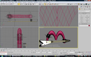

Friday, 14 November 2008
Week 8 - Starting the M
This week was mostly used to begin to give the characters shape and try to give them any items and clothing that they might use.
I began to create the M using to cylinders and welding them together to give an M shape that was more rounded which I believe would of looked better then a square variation to give a better look. Welding the cylinders did give some trouble it seemed that at certain angles you could see like a grove at were the cylinders were connected but at most angles it would be fine.
Giving the M hair was simple to do; all that was needed for the M was to convert the M to an editable poly and selecting a portion and applying a hair and fur modifier to it. Changing the hair was just using the styling tools within the modifier and changing the colour, length and style.
The M hair caused a lot of rendering problems on some machines causing the hair to randomly appear on the bottom of the piece. In my opinion the hair also did not look to good as I wanted which was probably because the hair went through the grove in the middle of the M and did look much humanised.
Friday, 7 November 2008
Week 7
In this week the group consisting of myself, Sam and James discussed separating the YMCA characters so that each person would do a character of the YMCA and whoever finished the basic design and build first would do the remaining A.
We also discussed that the end of our piece would have a band like scene of all the YMCA characters in position to spell out YMCA while participating in the band to show off more of the live band nights offered by the YMCA.
The YMCA characters were going to differ as we had decided that each character would represent a different genre of music and thus giving them a personality.
The characters we decided are Punky Y, Heavy Metal M, DJ C and Reggae A; we believed that giving the characters names and the impression of a personality could relate them better to the audience.
The characters will be more cartoon like the realistic since we believed that with the target audience going from young children up to the age of round 16/17 that a cartoon like advert will gain more attention then going for an ultra realism type approach. With this we also considered rendering times etc as to not have to rush everything at the last moment with animation taking a long time to do.
I searched the internet to find images of stereotypical fan of heavy metal. The common aspects I found were spiked hair and spiked jewellery or clothing.
The hair was decided to run through the grove of the top of the M and it to be spiked high up using a brown or dark orange colour.
Friday, 31 October 2008
Week 6 - 3D face The finale
This week adding the skull, lips and eyes proved a tough challenge causing me to not be able to do more then I wanted. I would of liked to have done the ears and textured the face with a skin tone.
To start off with I encounter problems with doing the skull because I had the edge of my face shaped badly. This caused aligning the skull to the head to go badly wrong with a lot of dents and drooping skin in places making the face look very unreal although if my aim was to make the face look old then it may have some use. Even with a turbo smooth modifier
With the skull the neck also seems to point backwards as well as a hole that appeared with I was using the symmetry modifier and I was unable to correct because if I moved it or decreased the threshold then the forehead would go into a point or cross over through itself.
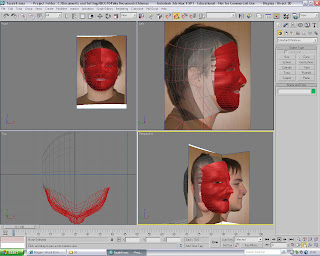
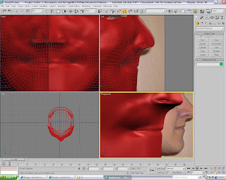
The eyes were simple yet were tricky to place. The eyes had to fill the sockets in each view to be effective and a simple sphere would not work. I took a sphere and stretched it until it was bigger then the socket and then tried to align it into the socket as well as rotating it so that it did not blotch out of one side of the eye. This had to be done twice because using a mirror or symmetry modifier would not put the eye in the right position.


To start off with I encounter problems with doing the skull because I had the edge of my face shaped badly. This caused aligning the skull to the head to go badly wrong with a lot of dents and drooping skin in places making the face look very unreal although if my aim was to make the face look old then it may have some use. Even with a turbo smooth modifier
With the skull the neck also seems to point backwards as well as a hole that appeared with I was using the symmetry modifier and I was unable to correct because if I moved it or decreased the threshold then the forehead would go into a point or cross over through itself.

The lips I found easy once I knew what to do for them. Using the create tool to place vertex's and using the create tool with poly to make the surface the lips could be added to the rest of the face. I think they came off well although they may be a bit small in context with the entire face. The ridges needed into the lips could be softened since they seem quite deep but that could also appear on a normal face.
The lips have somehow managed to form a smile although during the mapping it was unintended, I think this happened because of the way I had done the curves in the face causing the lip edge to be raised slightly.
The lips have somehow managed to form a smile although during the mapping it was unintended, I think this happened because of the way I had done the curves in the face causing the lip edge to be raised slightly.

The eyes were simple yet were tricky to place. The eyes had to fill the sockets in each view to be effective and a simple sphere would not work. I took a sphere and stretched it until it was bigger then the socket and then tried to align it into the socket as well as rotating it so that it did not blotch out of one side of the eye. This had to be done twice because using a mirror or symmetry modifier would not put the eye in the right position.

While doing the eyes I decided to change the general colour of the face to a more fleshy tone and added a simple texture to the eyes just to give them some appearance.
Overall I have found this work to be good but found that there can be a lot of bits that go wrong with constructing it. I had a lot of difficulty with doing the topology and building the quads and because of it has to redo the face from scratch several times so that the face would fit and resemble a face. I am unhappy in some aspects on how the face turned out and that I ran out of time to add bits to it to make it look better. I think that more time was needed on the work so that it could of looked fuller and more complete as well as being able to hopefully iron out any of the dents and that with cause the face to look unnatural and disfigured.

Subscribe to:
Comments (Atom)


